There’s an adage about design that goes something like, “we only notice good design when it’s no longer around.” And no more is this true than in the design of readable materials: typography.
Amateur typographers and typesetters have a whole host of options these days for mucking about with how their documents and papers look. Word processing has allowed many to fancy themselves typographical aficionados with its ease of use.
Today, more than ever, documents end up in readers’ hands poorly typeset. And that’s probably because people now skip a crucial stage of typesetting. Just a few decades earlier, someone had to manually ready a draft—likely handwritten or from a typewriter—to be printed properly.
This process would fix several unattractive elements that we see in modern documents. Today’s Microsoft Word documents are akin to the memos that someone would type on a typewriter in the past.
That, of course, does not suit readers, especially ones whom one would want to impress. Indeed, professional typesetters generally favour software like Adobe InDesign for publishing or perhaps LaTeX for mathematical pieces.
These are generally not practical for daily use, but there are some changes we all can make to our current Word documents or Google Docs to make them more aesthetically appealing.
Change the Spacing
Double spacing may be what your teachers want—or even what editors require, but it is not the standard for final documents. That’s because it can sometimes be difficult to follow the end of each line to the next: our eyes have to move quite a bit vertically. The main purpose of double spacing is to make it easy to add edits.
Instead of 200% spacing, try 115% to 135% spacing.
Do Not Underline
This is a poor typewriter habit. When it was difficult to switch from roman typeface (normal text) to italics or bold, people would use underscores to emphasize text.
Use italics instead in standard text. Use bold for headings. Underline is only appropriate for URLs and hyperlinks.
Make the Text Smaller
Once again, this is a remnant of typewriter and editing practices. We are too often encouraged to use 12 point font. That’s fine for many digital documents, but if you’ve ever printed out a 12-pt document—it pretty huge.
Try 10 or 11 point size for most fonts. Depending on the typeface, however, this advice may not apply.
Use a Different Typeface
There are plenty of great typefaces out there. Don’t just stick with Arial or Times New Roman or Calibri.
Take a look at this webpage for some good font recommendations. A personal serif favourite of mine is Charter.
Make the Margins Larger (or, if you feel fancy, use two columns)
This will single-handedly make the most difference. Our eyes can find it quite difficult to jump back to the start of the next line when the lines are long. The standard one-inch margins on letter size paper are too small to allow for comfortable reading.
There are two remedies to this: use a larger margin (e.g., 1.5 to 1.875 inches) or try a multi-column layout. Don’t be afraid of whitespace: it often eases a reader when they find lots of margin space.
If you’re concerned about not being able to fit enough text, you can experiment with making the top and bottom margins a bit shorter. However, no matter what, do not compromise on the left and right margins.
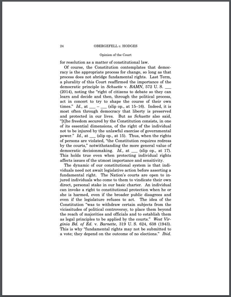
For some examples for good typography, take a look at some U.S. Supreme Court Opinions, like this one:
For more resources on typography, I highly recommend Butterick’s Practical Typography, which can be found here.
Image Sources: Featured