A leg up?
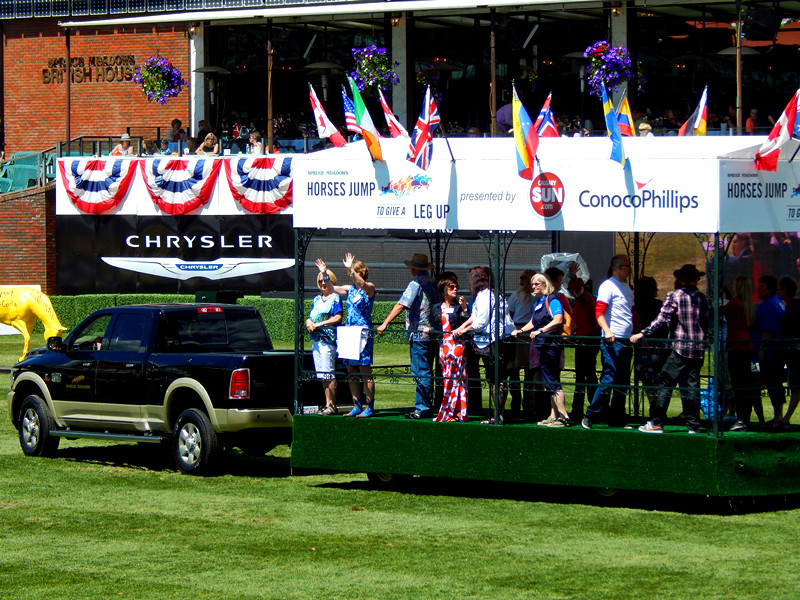
During this past Saturday, I was at the National tournament over at Spruce Meadows, anticipating the “parade of nations” after the race. That was when they’d mention the winners for the design prizes of the Horses Jump to Give a Leg Up program. The number one winner would get $10,000, second place $7,000, and third $3,000.
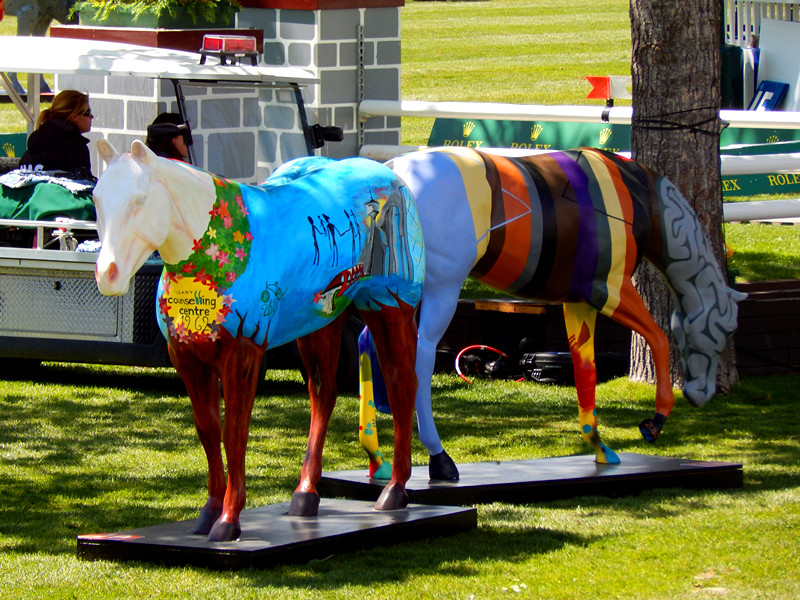
Man, were all they stunning and creative in their own right.
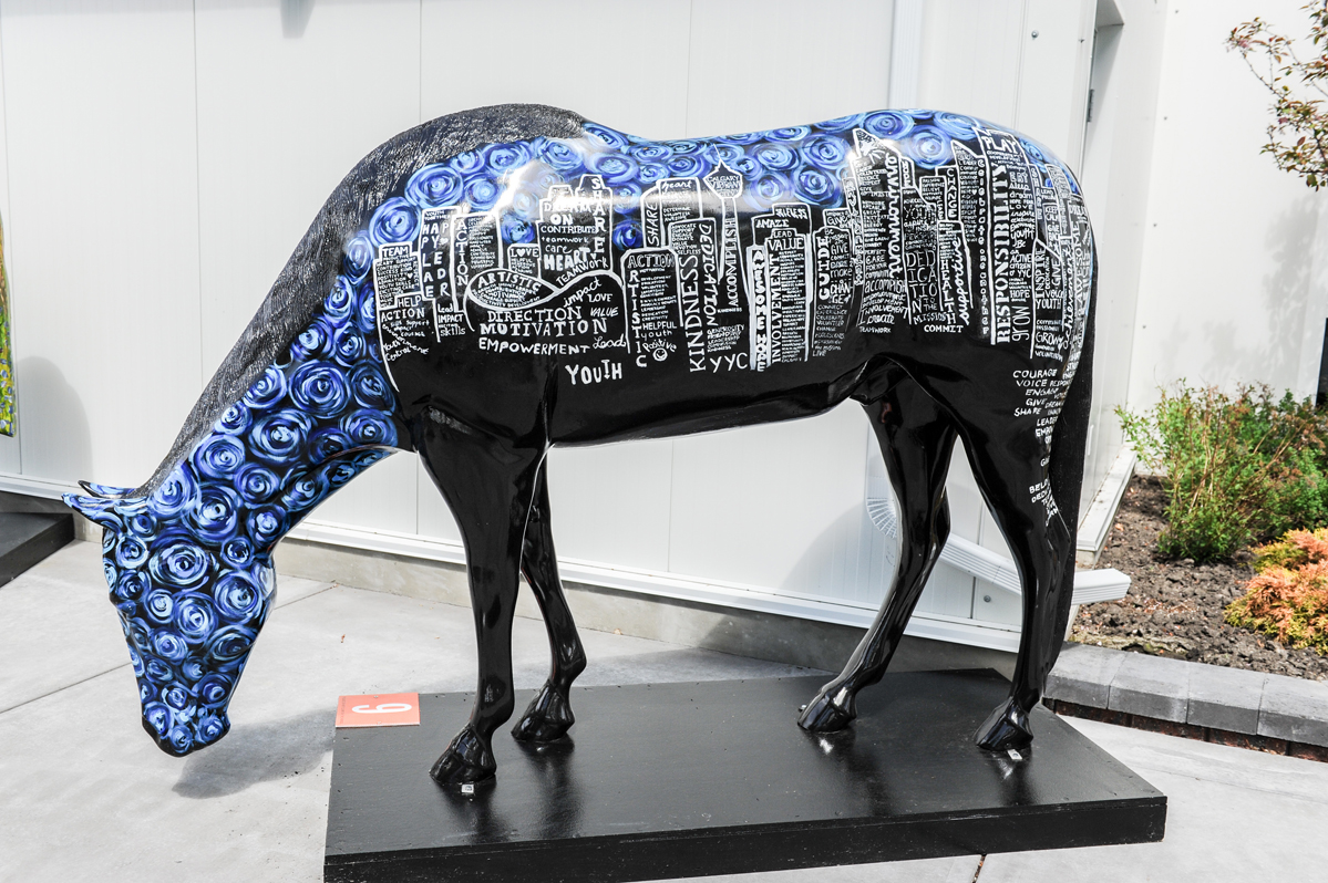
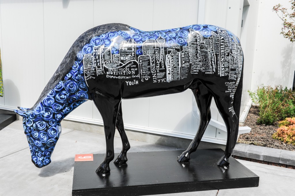
Youth Central is one of the twenty not-for-profit organizations that is participating in this contest to design a fibreglass horse. It’s a continuation of “Show Your Colours,” the community involvement program that Spruce Meadows had in previous years, but with a new spin. The design prize is just one part of the program; all of the designed horses will be placed in a silent auction online and all proceeds will go to the respective originators. Even though we didn’t win, it was sweet seeing this funding going to some of the fellow organizations that impact our community so much.
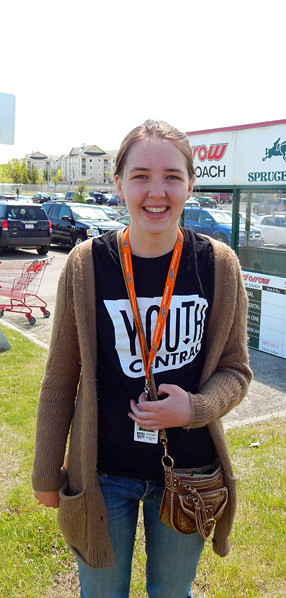
It’s one thing to be browsing through these designs, but another to be the designer behind a piece like this and ’em youth volunteers who helped paint it. I spoke to Jessalyn Rohs, who is one of our Youth Volunteer Corps (YVC) team leaders and the one behind creating our organization’s horse design.
YAA: Give me your overview of the design.
JR: So, our horse design depicts Calgary built out of words that we felt represented Youth Central. We felt a black horse would stand out and represent the colour of the Youth Central logo. I decided to base off the blue sky of Vincent van Gogh’s Starry Night to add an artistic element to the horse.
YAA: I noticed you had used a lot of adjectives on the buildings of the design Does that reflects perhaps what you think about Calgary?
JR: The words we chose I think represents all of Youth Central’s vision towards youth engagement in the city.
YAA: Does this artwork reflect who you are as well?
JR: This horse is not in the style of artwork I usually create; however, I really enjoyed working with the youth volunteers to paint it.
YAA: Did it take a lot of consideration to think of the design?
JR: Yes, especially at the beginning when there was “considerable discord” between the designs we wanted to initially choose: it was first between horse anatomy, a unicorn, and a prairie theme.
YAA: What is your favourite part of the horse design?
JR: My favourite part is the sky because it is colourful and was fun to paint.
YAA: Have you learned anything from embarking on such a task?
JR: I learned how to work with youth in an artistic capacity, trying to balance giving them direction while letting them express themselves as an artist.
YAA: How do you want promote your horse design?
JR: I would like to encourage everyone who was involved in horse painting to share this with their friends and family.
YAA: Are you anticipating the results of the auction?
JR: I think we are all hoping that it is a successful fundraiser overall.
It was interesting to hear her vantage point, particularly the view she has as a creator. Out of a quiet aura came this art piece, one with a special medium, the fiberglass horse. Each and every one of these horse designs together foster a stage for those like her. I think it has to take a lot of confidence for her to bring forward this idea to the stage, especially as she is not a professional artist.
Thanks to her and all the other organizations for this creativity – come the auction results September, each will receive a funding boost in what they do. In the meanwhile, I have to say that I find the analytics in the rising bids darn interesting. To bid on the Youth Central horse, click here.
